
The New Pepsi Logo – Smash or Trash?
15 Mar 2009, 3:51pm

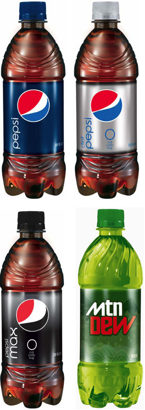
I am sure you all have seen the new Pepsi logo by now. What do you think? I myself am not impressed. Also – which I find totally weird – the logo changes slightly depending on the type of Pepsi it is. The white stripe gets larger if the product is Pepsi Max (whatever the Hell THAT is) and gets skinnier for Pepsi Zero. I guess one corporate logo just wasn’t enough for these guys. And have you seen the new bottles? They TOTALLY look like wrinkly penises. Seriously. Check ’em out here if you don’t believe me.
Whatever you think, I LOVE Lawrence Yang’s take on it…

NAILED it!

Chit Chat
i will forever now see lawrence yang’s illustration in the new (pfft.) pepsi logo. and that is AWESOME.
pc: you are spot on in re: the new bottles. bleh.
Contribute to the Conversation