New GAP Logo
6 Oct 2010, 9:48am
GAP has decided to redesign their logo:
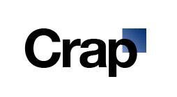
Well, that didn’t turn out well. This looks like it was designed by a corporate committee. “Hey, Helvetica is still hot, right? Use that. And, hey, tack on a blue box somewhere so that people can still relate to the old logo. OK, gotta go play golf!”
Really bad.
Be Consistant – REVISED
12 Aug 2009, 4:16pm
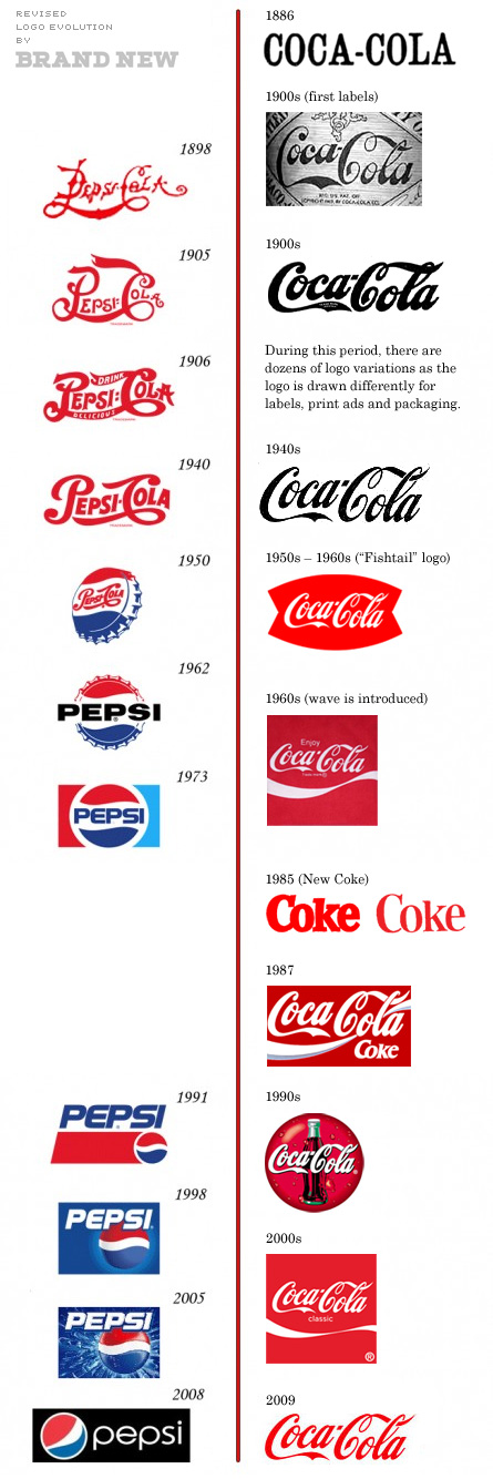
Remember that post about the timeline of both Pepsi and Coca-Cola logos? Well, there is an update…
Still interesting…
(via Brand New)
The Evolution of Corporate Logos
7 Oct 2008, 10:42am
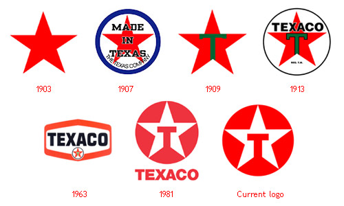
Holly kay-wrap! Here is an awesome collection of a bunch of large corporation logos and how they have changed since the companies began. This is pretty sweet (and comes to us via Metafilter).


fig. 5~ NEWISH COMMENTS: