
Dairyland Package Design

I like these. Yes. I do. Minimalist haters can suck it. These were designed by Julius Tigno when he was a student at the Academy of Art and, in my opininion, he did a dynamite job. I would switch brands for the handle on the large one alone.
At first I thought that the product type should be larger but the more I thought about it, the less I was convinced of that. When I am in the dairy isle at the supermarket, I grab my milk by the carton color. Sure, the first time I am trying a new brand I’ll have to look for the text but, after that, all I need is that light blue telling me that it is fat free. I don’t need some extra large type yelling at me “FAT FREE!” But that’s just me.
(Via The Dieline)

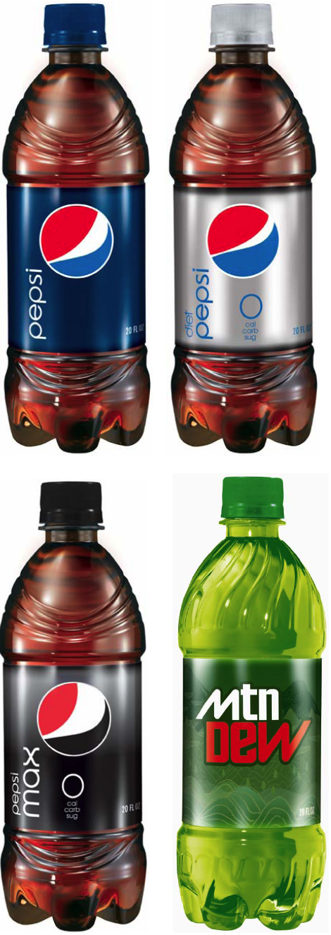
The New Pepsi Logo – Smash or Trash?

I am sure you all have seen the new Pepsi logo by now. What do you think? I myself am not impressed. Also – which I find totally weird – the logo changes slightly depending on the type of Pepsi it is. The white stripe gets larger if the product is Pepsi Max (whatever the Hell THAT is) and gets skinnier for Pepsi Zero. I guess one corporate logo just wasn’t enough for these guys. And have you seen the new bottles? They TOTALLY look like wrinkly penises. Seriously. Check ’em out here if you don’t believe me.
Whatever you think, I LOVE Lawrence Yang’s take on it…

NAILED it!
Consumers Vs. Designers and Corporate Heads – Case of the Tropicana OJ Containers

Just two months ago Tropicana (owned by PepsiCo) dropped it’s new carton design (created by Peter Arnell of the Arnell Group) on consumers. That is it up there on the right. Needles to say, US customers flipped out (as they really do fear change) and bitched and moaned to Tropicana headquarters. Comments about the new packaging (containing the same product inside) were in the range of ‘ugly’, ‘stupid’ and ‘a generic bargain brand’. They also mentioned that it was hard to differentiate between their different juices.
Tropicana listened to their customers and, saying that they, “…underestimated the deep emotional bond” their loyal customers had with the product, have said that they are returning to their old package design. Even the designer (possibly one of the worst bosses in New York) has sided with the head honchos at Tropicana North America on this one saying, “Tropicana is doing exactly what it should be doing. I’m glad Tropicana is getting this kind of attention.” The only thing that they are keeping is the new cap design.
What do you think? Do you drink it? Does it matter to you? Which one do you like better? If I get 50 comments on this post I will raffle of the latest edition of McSweeney’s Quarterly. Family is excluded from raffle. Sorry Karen and Marc.
(via designbloom.com)

fig. 5~ NEWISH COMMENTS: