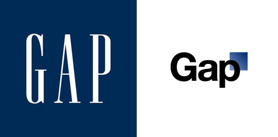
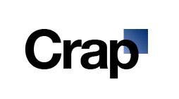
New GAP Logo
6 Oct 2010, 9:48am
GAP has decided to redesign their logo:
Well, that didn’t turn out well. This looks like it was designed by a corporate committee. “Hey, Helvetica is still hot, right? Use that. And, hey, tack on a blue box somewhere so that people can still relate to the old logo. OK, gotta go play golf!”
Really bad.
Saturday Morning Animation – THE RETURN OF JOHN FRUM
10 Apr 2010, 5:53pm
I won’t pretend to know one bit of what goes on in this short but I sure do like it and it’s Aeon Flux feel. It is a trip and a half…


fig. 5~ NEWISH COMMENTS: