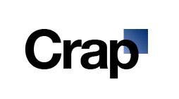
New GAP Logo
6 Oct 2010, 9:48am
GAP has decided to redesign their logo:
Well, that didn’t turn out well. This looks like it was designed by a corporate committee. “Hey, Helvetica is still hot, right? Use that. And, hey, tack on a blue box somewhere so that people can still relate to the old logo. OK, gotta go play golf!”
Really bad.


Chit Chat
They only gave me $5, what did you expect?
http://www.horriblelogos.com/gap/
Contribute to the Conversation