Consumers Vs. Designers and Corporate Heads – Case of the Tropicana OJ Containers
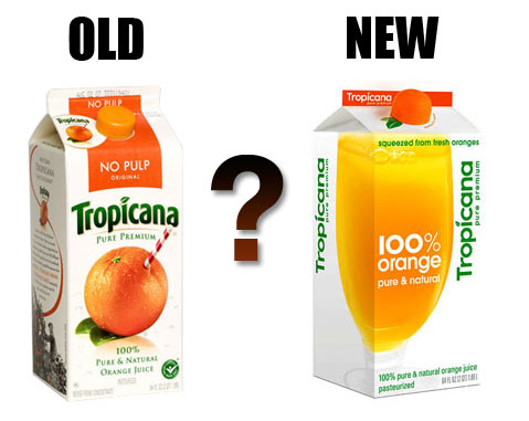
Just two months ago Tropicana (owned by PepsiCo) dropped it’s new carton design (created by Peter Arnell of the Arnell Group) on consumers. That is it up there on the right. Needles to say, US customers flipped out (as they really do fear change) and bitched and moaned to Tropicana headquarters. Comments about the new packaging (containing the same product inside) were in the range of ‘ugly’, ‘stupid’ and ‘a generic bargain brand’. They also mentioned that it was hard to differentiate between their different juices.
Tropicana listened to their customers and, saying that they, “…underestimated the deep emotional bond” their loyal customers had with the product, have said that they are returning to their old package design. Even the designer (possibly one of the worst bosses in New York) has sided with the head honchos at Tropicana North America on this one saying, “Tropicana is doing exactly what it should be doing. I’m glad Tropicana is getting this kind of attention.” The only thing that they are keeping is the new cap design.
What do you think? Do you drink it? Does it matter to you? Which one do you like better? If I get 50 comments on this post I will raffle of the latest edition of McSweeney’s Quarterly. Family is excluded from raffle. Sorry Karen and Marc.
(via designbloom.com)


Chit Chat
I say they screwed up when they decided not to update Tropic Ana, the seemingly underage/ possible post-op transexual orangeservant.
http://www.vintagedollcollector.com/addolls/tanasm.jpg
I might just give you the book for that awesome link, Christopher (aka KtB. Can’t fool me!).
Bottom line: can we drop the whole sideways text thing? Top to bottom, left to right. That is how we read. And really, do we need to “re-brand” Pepsi? Do people not know what it is?
My Pepsi post is coming up next…
My initial reaction to the re-do was “oh-modern!” But the longer I stood there, the more I disliked it. I don’t need more reminders that the soda company owns the orange juice company. I also don’t need to spend extra time deciphering the real information on the box and the fake information on the box. 100% juice is not the same as 100% orange.
I am happy to embrace change when change is for the better, but this is like changing all the road TO make them less clear.
that last bit should have said “…changing all the road signs in order to make them less clear.”
Since the documentary “Helvetica” I’ve been seeing this font used more and more, like everywhere. And quite frankly I’m over it! It’s just a cheap attempt to appeal to the hipster market…or are hipsters the ones coming up with the new tropicana design and don’t know anything but helvetica?
Sorry, Bill. Not Helvetica. If it were, there would be an ascender on the lowercase ‘a’ and the ‘c’ would have longer arms. It is similar though. It is more similar to Futura really except the ‘c’ has short arms. But it is very easy to confuse the two.
and that’s why I suck
the new design is reminiscent of th generic products of the 70s.
the design is smart in that you can see the juice glass from the side as well as the front.
for the record: i only drink the florida’s natural brand from the supermarket b/c i like that it’s all us produce and the company buys oranges from independent groves. now. the package TELLS me that. whether it’s true, whether i want to know if it’s true is another thing. 😉
for the record: yeah, the new design looks like it’s riding a wave that will be past before long.
also: am a fan of arial.
I want to boycott supermarkets until this minimalism craze is over. They all look generic. Aside from Pepsi and Tropicana, Kraft cheese jumps out as the worst offender: http://www.joehribar.com/wordpress/files/2009/04/kraft_cheese_7.jpg
Contribute to the Conversation