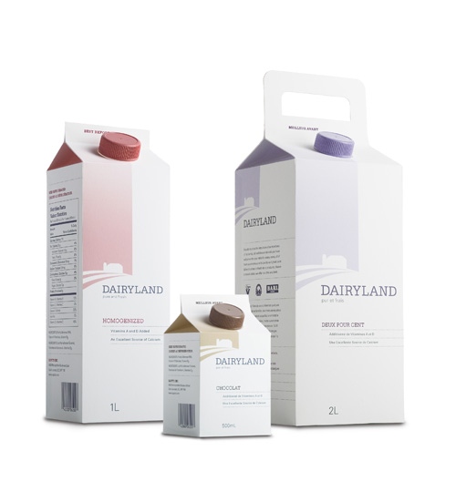
Dairyland Package Design
5 May 2009, 7:59am
I like these. Yes. I do. Minimalist haters can suck it. These were designed by Julius Tigno when he was a student at the Academy of Art and, in my opininion, he did a dynamite job. I would switch brands for the handle on the large one alone.
At first I thought that the product type should be larger but the more I thought about it, the less I was convinced of that. When I am in the dairy isle at the supermarket, I grab my milk by the carton color. Sure, the first time I am trying a new brand I’ll have to look for the text but, after that, all I need is that light blue telling me that it is fat free. I don’t need some extra large type yelling at me “FAT FREE!” But that’s just me.
(Via The Dieline)


fig. 5~ NEWISH COMMENTS: