
Big Plastic Head Lingo – “LOINK”
Yes, I have created my first word and that word is:
loink: n. A broken web URL; A link in a web page that either goes to the wrong location or nowhere at all.
That’s right. That’s MINE! You can go suck it, Urban Dictionary. We already have PLENTY of different words for “penis”, thank you very much. You DO NOT need this one.
One Day I Will Be Treated Like a Designer…

Yes. This is how I feel most of the time these days. I am about tired of it. So I made this. High quality prints available…
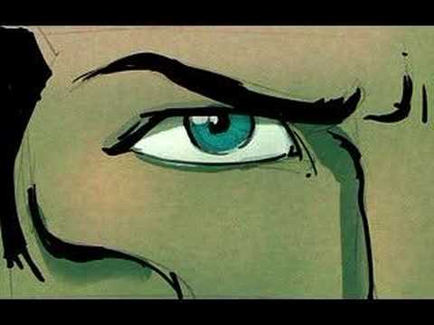
Saturday morning Animation – Technological Threat

This was a 1988 Academy Award nominee from Bill Kroyer but was beat out by Tin Toy from John Lassiter of Pixar fame.
Coroporate Re-Branding Fail – Sci Fi to become SyFy

File this in the “What Were They Thinking” category. The SciFi Network has decided to change their name to SyFy.I know, right? Looks like “Siffy” to me too. According to their own press release (WARNING: lots of bad corporate speak):
“…broadens perceptions and embraces a wider and more diverse range of imagination-based entertainment including fantasy, paranormal, reality, mystery, action and adventure, as well as science fiction…”
That may be so but…SyFy? So, phonetically it is the same. I get it. Don’t want to confuse anyone now do we? But if you are trying to diversify your content on your network and distance yourself from being just a science fiction (Sci-Fi) channel, why call it something that STILL IS PRONOUNCED SCI-FI!?! It is the SAME THING but spelled poorly! If you gotta change it, frickin’ change it.
And a tag line, “Imagine Greater”!?! Horrible. People loosing their jobs left and right and someone got paid to come up with that!?! Man, I would love to see the ones that they DIDN’T choose. Apparently there were over 300! There must have been some dandy ones. As @SoundSystemSDC said on Twitter this morning, “it beat out ‘It’s Imaginably Great!’ and ‘We got yer flyin’ cars right here.'” I love that last one.
The person most responsible for this is the president of The SciF – er- SyFy Network (Ew. Now I feel dirty) David Howe who says amazing things like:
“We really do want to own the imagination space.”
You want to own the what now?
“When we tested this new name, the thing that we got back from our 18-to-34 techno-savvy crowd, which is quite a lot of our audience, is actually this is how you’d text it. It made us feel much cooler, much more cutting-edge, much more hip, which was kind of bang-on what we wanted to achieve communication-wise.”
Maybe they could add a Poochie character.
“…build a broader, more open and accessible and relatable and human-friendly brand.”
“Human-friendly”? Is there any other kind?
And how about his description of their new series ‘Warehouse 13”:
“It is a dramedy and it is set in the here and now. It’s a kind of an Indiana Jones meets ‘Moonlighting’ meets ‘The X-Files. This is a very accessible, relatable, fun show.”
I just threw up in my mouth a little.
(Quotes taken from tvweekcom article)
I would like to suggest these other changes to some other top cable networks so they too can distance themselves from their base:
Lifetime = LyfeTyme
he History Channel = The HySTORY Channel
Comedy Central = Comedy Polarized
The Weather Channel = The Whether Channel
The Food Network = I’d Eat That!
USA Network = ‘Merica
MTV = Garbage
OK, where’s my check?
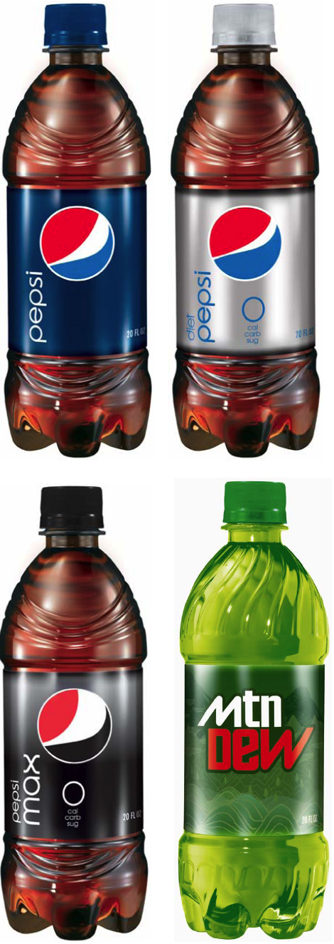
The New Pepsi Logo – Smash or Trash?

I am sure you all have seen the new Pepsi logo by now. What do you think? I myself am not impressed. Also – which I find totally weird – the logo changes slightly depending on the type of Pepsi it is. The white stripe gets larger if the product is Pepsi Max (whatever the Hell THAT is) and gets skinnier for Pepsi Zero. I guess one corporate logo just wasn’t enough for these guys. And have you seen the new bottles? They TOTALLY look like wrinkly penises. Seriously. Check ’em out here if you don’t believe me.
Whatever you think, I LOVE Lawrence Yang’s take on it…

NAILED it!
Saturday Morning Animation – Death Cab For Cutie – Grapevine Fires
Sorry this is late but here is your Saturday Morning Afternoon Animation. It is the new video for Death Cab for Cuties song Grapevine Fires directed by Walter Robot Studio.
ATTENTION: WFMU is in desperate need of your help. It is a one-of-a-kind radio station out of New Jersey that you can listen to on-line. Let me tell you people, if you can’t find a show on this station that you don’t like – nay – become addicted to, then I DO NOT KNOW YOU! And they need our help. If they do not reach their goal this year they could lose their construction permit for a new transmitter. If that happens, I WILL HUNT DOWN EVERYONE WHO READS THIS BUT DOES NOT PLEDGE!! Even $15 will help. Please go here and pledge what you can today. I mean, C’mon…$15 is not even a weeks worth of coffee when these folks are bringing it EVERY DAY!
Get on it. Please.
Saturday Morning Animation – Guide Dog
The sequel to “Guard Dog” by Bill Plympton featured last week.
Over 40 – February 2009


February. A short month. I spent most of it at work, on my Birthday Bike and in Eureka/Arcata. I drank out of a glass that said, “Paddy” on it, too, up in Portland. I went and saw the Portland Trail Blazers beat the New York Nicks with a last second shot. Pretty sweet considering the last NBA game I went to was during Kareem Abdul-Jabbar’s final game against the Sacramento Kings. (We are talking mid eighties here folks.) I also found some old food in the fridge. Gross.
The big thing that I REALLY did was finally get out my mix CD to my bestest of friends. I put alot of thought, energy and time into it but I enjoy doing it. I think my peeps do too. Hope all y’all that got it are enjoying it!
Consumers Vs. Designers and Corporate Heads – Case of the Tropicana OJ Containers

Just two months ago Tropicana (owned by PepsiCo) dropped it’s new carton design (created by Peter Arnell of the Arnell Group) on consumers. That is it up there on the right. Needles to say, US customers flipped out (as they really do fear change) and bitched and moaned to Tropicana headquarters. Comments about the new packaging (containing the same product inside) were in the range of ‘ugly’, ‘stupid’ and ‘a generic bargain brand’. They also mentioned that it was hard to differentiate between their different juices.
Tropicana listened to their customers and, saying that they, “…underestimated the deep emotional bond” their loyal customers had with the product, have said that they are returning to their old package design. Even the designer (possibly one of the worst bosses in New York) has sided with the head honchos at Tropicana North America on this one saying, “Tropicana is doing exactly what it should be doing. I’m glad Tropicana is getting this kind of attention.” The only thing that they are keeping is the new cap design.
What do you think? Do you drink it? Does it matter to you? Which one do you like better? If I get 50 comments on this post I will raffle of the latest edition of McSweeney’s Quarterly. Family is excluded from raffle. Sorry Karen and Marc.
(via designbloom.com)
Saturday Morning Animation – Guard Dog by Bill Plympton
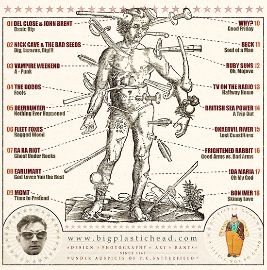
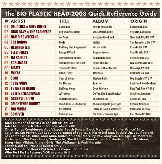
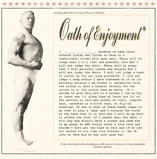
The Big Plastic Head Music Mix 2008

Oh YES! I FINALLY I finished my 2008 mix CD. Every year, I take all of the music that was released in the previous year and distill the songs down to a manageable fifteen to twenty tracks. I burn them on to a bunch of CDs and send them out to all my friends. WAY better than Christmas cards I think. This is year four or five and I do really enjoy doing it.
I also make a swell original cover for each “release” because God knows I need more portfolio pieces that reflect the work I WANT to do, not the work that I am forced to do.
(Click the above images to see the back and inside.)
Saturday Morning Animation – Kaboom! by Pes
Another clever animation by Pes. LOVE the clowns.
UNO Hispanic Branding Posters

Go check out this nice collection of Hispanic posters over at Behance Network. Unfortunately there isn’t any information about them at all. I think they are all by Luis Fitch over at Uno Branding but I am not sure.
Saturday Morning Animation – Superman Short
This is less animation than it is a series of stills. I still really like it.
Barack Obama’s First Signature as President

That is one nice signature. Sure beats the last guys.

fig. 5~ NEWISH COMMENTS: