
“Stare at the Monitor All Day…”

I can relate….
Poster by Shaz Madani via FFFFOUND
Dairyland Package Design

I like these. Yes. I do. Minimalist haters can suck it. These were designed by Julius Tigno when he was a student at the Academy of Art and, in my opininion, he did a dynamite job. I would switch brands for the handle on the large one alone.
At first I thought that the product type should be larger but the more I thought about it, the less I was convinced of that. When I am in the dairy isle at the supermarket, I grab my milk by the carton color. Sure, the first time I am trying a new brand I’ll have to look for the text but, after that, all I need is that light blue telling me that it is fat free. I don’t need some extra large type yelling at me “FAT FREE!” But that’s just me.
(Via The Dieline)

A Kit to Thwart Writers Block

All creative types have been there: no fresh ideas coming up in the old noggin. Elizabeth Dilk decided to make her own “idea box” for times when inspiration doesn’t strike. The kit has a couple of writing pads, pre-chewed pencils a 12-sided die with random actions written on each side. To advertise it, she screen printed a bunch of napkins that are pre-doodled with depressing comments on one side and the logo on the other. Unfortunately, this isn’t a real product. It was a design project where the designers were, “…asked to find something I hate, change it and make it better, and then advertise it.” No reason you can’t go off and make your own though…
(via Designbloom)


Adidas: Kopanya


I am not a follower of socce….er….football, I mean, but I sure like this ad campaign from Adidas to celebrate the first ever Africa hosted Confederation’s Cup . The way to be famous in Africa is to have a haircut named after you and have your likeness painted on a wooden board or on the side of a building advertising your special coif. Adidas had these commissioned, each one representing the stars of the game and their special “cuts” – their noted skill at the game.
I do not know who they commissioned to do these but I sure hope they made the effort to find people who really do paint these signs in Africa and not just someone to knock ’em off.
Kopanya is a South African word for togetherness and is part of Adidas global campaign – “Together I am strong”.
(via www.ibelieveinadv.com)
Kinetic Wave Sculptures by Ruben Margolin
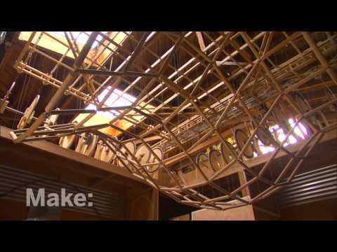
Reuben Margolin is a San Francisco Bay Area artist who creates amazingly complected yet elegant sculptures. Inspired from nature and built using found objects, simple pulleys and motors, he is truly creating inspired stuff. And listening to him talk about his work is just as inspiring.
The video is a Make Magazine profile and well worth watching. He even makes a stop by Urban Ore, one of the greatest places on the planet as far as I am concerned. He is truly creating inspired stuff and I really enjoy hearing him talk about his work.
Western Tentacled Jay Poster

Again, I have too many posters sitting around unframed right now (including a nice Obama one) but I am VERY tempted to purchase “Western Tentacled Jay” by Chicago illustrator Phineas X. Jones.
Edition of 150, signed and numbered. Thirty bucks at octophant.us. Someone please go buy this. For me.
(via OMG Posters)
UPDATE: My wife gave me the thumbs up on this one. Damn if I didn’t marry UP! Thanks, sweetheart!
As Fast As I Can T-Shirt

How could you not love this Threadless Tee by Thomas De Santis?
Coroporate Re-Branding Fail – Sci Fi to become SyFy

File this in the “What Were They Thinking” category. The SciFi Network has decided to change their name to SyFy.I know, right? Looks like “Siffy” to me too. According to their own press release (WARNING: lots of bad corporate speak):
“…broadens perceptions and embraces a wider and more diverse range of imagination-based entertainment including fantasy, paranormal, reality, mystery, action and adventure, as well as science fiction…”
That may be so but…SyFy? So, phonetically it is the same. I get it. Don’t want to confuse anyone now do we? But if you are trying to diversify your content on your network and distance yourself from being just a science fiction (Sci-Fi) channel, why call it something that STILL IS PRONOUNCED SCI-FI!?! It is the SAME THING but spelled poorly! If you gotta change it, frickin’ change it.
And a tag line, “Imagine Greater”!?! Horrible. People loosing their jobs left and right and someone got paid to come up with that!?! Man, I would love to see the ones that they DIDN’T choose. Apparently there were over 300! There must have been some dandy ones. As @SoundSystemSDC said on Twitter this morning, “it beat out ‘It’s Imaginably Great!’ and ‘We got yer flyin’ cars right here.'” I love that last one.
The person most responsible for this is the president of The SciF – er- SyFy Network (Ew. Now I feel dirty) David Howe who says amazing things like:
“We really do want to own the imagination space.”
You want to own the what now?
“When we tested this new name, the thing that we got back from our 18-to-34 techno-savvy crowd, which is quite a lot of our audience, is actually this is how you’d text it. It made us feel much cooler, much more cutting-edge, much more hip, which was kind of bang-on what we wanted to achieve communication-wise.”
Maybe they could add a Poochie character.
“…build a broader, more open and accessible and relatable and human-friendly brand.”
“Human-friendly”? Is there any other kind?
And how about his description of their new series ‘Warehouse 13”:
“It is a dramedy and it is set in the here and now. It’s a kind of an Indiana Jones meets ‘Moonlighting’ meets ‘The X-Files. This is a very accessible, relatable, fun show.”
I just threw up in my mouth a little.
(Quotes taken from tvweekcom article)
I would like to suggest these other changes to some other top cable networks so they too can distance themselves from their base:
Lifetime = LyfeTyme
he History Channel = The HySTORY Channel
Comedy Central = Comedy Polarized
The Weather Channel = The Whether Channel
The Food Network = I’d Eat That!
USA Network = ‘Merica
MTV = Garbage
OK, where’s my check?
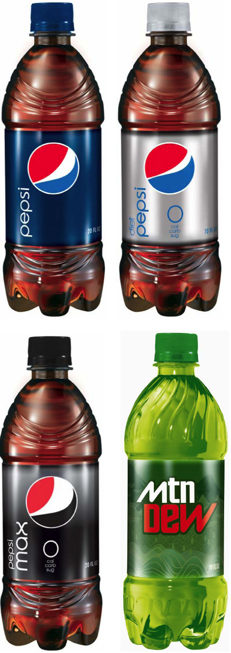
The New Pepsi Logo – Smash or Trash?

I am sure you all have seen the new Pepsi logo by now. What do you think? I myself am not impressed. Also – which I find totally weird – the logo changes slightly depending on the type of Pepsi it is. The white stripe gets larger if the product is Pepsi Max (whatever the Hell THAT is) and gets skinnier for Pepsi Zero. I guess one corporate logo just wasn’t enough for these guys. And have you seen the new bottles? They TOTALLY look like wrinkly penises. Seriously. Check ’em out here if you don’t believe me.
Whatever you think, I LOVE Lawrence Yang’s take on it…

NAILED it!
Consumers Vs. Designers and Corporate Heads – Case of the Tropicana OJ Containers

Just two months ago Tropicana (owned by PepsiCo) dropped it’s new carton design (created by Peter Arnell of the Arnell Group) on consumers. That is it up there on the right. Needles to say, US customers flipped out (as they really do fear change) and bitched and moaned to Tropicana headquarters. Comments about the new packaging (containing the same product inside) were in the range of ‘ugly’, ‘stupid’ and ‘a generic bargain brand’. They also mentioned that it was hard to differentiate between their different juices.
Tropicana listened to their customers and, saying that they, “…underestimated the deep emotional bond” their loyal customers had with the product, have said that they are returning to their old package design. Even the designer (possibly one of the worst bosses in New York) has sided with the head honchos at Tropicana North America on this one saying, “Tropicana is doing exactly what it should be doing. I’m glad Tropicana is getting this kind of attention.” The only thing that they are keeping is the new cap design.
What do you think? Do you drink it? Does it matter to you? Which one do you like better? If I get 50 comments on this post I will raffle of the latest edition of McSweeney’s Quarterly. Family is excluded from raffle. Sorry Karen and Marc.
(via designbloom.com)
UNO Hispanic Branding Posters

Go check out this nice collection of Hispanic posters over at Behance Network. Unfortunately there isn’t any information about them at all. I think they are all by Luis Fitch over at Uno Branding but I am not sure.
Patton Oswalt Posters From Jay Ryan

Oh my. It is not fair that I have five posters sitting at home that need framing and then come across these two awesome posters by Jay Ryan at The Bird Machine. These are from Patton Oswalt’s recent gigs in Athens and Atlanta Georgia and featuring Patton’s dog Grumpus and Star Wars action figures. (Patton is a huge Star Wars nerd.) I really shouldn’t get any more posters since we are out of wall space and I still have those other five to frame but, since my wife is gone for the week, the only question for me at this point is which one to buy. I think I am leaning toward the Boba Fett one.
The two posters approximately 17.5 x 23 inches, printed on white cover using five screens. Each has an edition of 300 that are signed and sell for $20. Fine art for twenty bucks, folks. Good deal. Now go support an artist!
High Line Park, NYC

I find this both exciting and inspirational. I remember hearing about plans to take a portion of the elevated train system in NYC and turn it into a park a few years ago but I wrote it off as just being a beautiful pipe dream that would never come to fruition. I have never been more glad to be wrong.
The High Line was built in between 1929 and 1934 on Manhattan’s West side. The High Line went right through the middle of city blocks so that freight trains (it could support 2, fully loaded) could roll right in to warehouses and factories to pick up and drop off goods. This alleviated any interference with street traffic that was starting to become a problem in the bustling city. By the 50’s, trucking began replacing the railway and, after some demolition in the 60’s, it finally stopped seeing any use in 1980.
 To make a long story short, advocates spoke, protection of the abandoned railway was granted and funding was raised. A design competition was held and architects were chosen. And now, it is physically happening. The first section of the High Line (Gansevoort Street to 20th Street) is projected to open in the Spring of 2009. That is almost now, people!
Here is a great video kind of showing what it will be:
Here is the Friends of the High Line blog that has some great info and updates.
Name My Design Company Machine

I have always been asked, “Why ‘Big Plastic Head’?” And I’m all, “I don’t know. It just sounds badass and is easy to remember.” And then they are all, “Pft. Whatever.” And then they never ask about it again. Nor return to the site. (Unless ‘they’ are my wife and brother-in-law. They are like groupies. Seriously. Can’t shake ’em.)
I guess next time I’ll use the “Name My Design Company Machine” from Breadline. It does a pretty good job except there are too many animals and not enough body parts. (One time it came up Green Banana Designs. Not bad, actually…)
(Via Draplin)
Art-O-Mat
 What do you do with those old cigarette vending machines? Decorate them all ‘Fantastico’, cram ’em full of cheap art, spread them out across the country and create an army of Art-o-Mats!
These things have been around for ten years already. There are 82 active machines featuring the works of over 400 artists. Put in your money, pull the lever and you are rewarded with a one-of-a-kind original art piece. How cool is that? Very cool, I say. It looks like there is one up in Eugene so I may have to drop in and check it out next time I am there.

fig. 5~ NEWISH COMMENTS: